
How to Use an Italicized Text Generator for Eye-Catching Social Posts

You spent forty minutes writing the caption. The hook is sharp, the CTA is tight, the line breaks are deliberate. You publish — and it disappears into a sans-serif wall identical to every other post in the feed. According to DataReportal's Digital 2024 Global Overview Report, people spend an average of 2 hours 23 minutes per day on social media, which means feeds are extremely crowded and scannability is a survival skill, not a flourish. An italicized text generator converts plain text into Unicode characters (𝘭𝘪𝘬𝘦 𝘵𝘩𝘪𝘴) that render across Instagram, LinkedIn, TikTok, X, and Facebook — no HTML, no app, no design software required.
What follows is the working version of how creators actually use these tools: the mechanics behind the character swap, the five style families and which one fits your brand, an eight-step paste workflow, the six mistakes that make styled posts look worse than plain text, the accessibility tradeoff that almost no generator tool warns you about, and platform-specific strategies for Instagram, LinkedIn, TikTok, X, and newsletters.
Table of Contents
- Why the Italic Button in Your Social App Doesn't Actually Italicize
- What Happens Inside the Generator (The Character Swap, Decoded)
- Five Italic Styles Compared — Which One Fits Your Brand Voice
- The Eight-Step Workflow to Generate, Test, and Publish Styled Captions
- Six Formatting Mistakes That Make Italicized Posts Look Worse Than Plain Text
- Platform-by-Platform Italics Strategy
- Quick Answers to the Questions You'll Have at 11 PM Before Posting
Why the Italic Button in Your Social App Doesn't Actually Italicize
Native italic formatting in Instagram, LinkedIn, TikTok, and most social apps is style metadata, not character data. When you tap "italic" in a rich-text field, the app stores a formatting flag attached to a text range. The moment that text moves to a different rendering context — a different app, a screenshot, a copy-paste into a third tool — the flag is stripped and you're left with plain roman text. This is why your formatting "vanishes" when you paste a caption from one platform into another.
Most social platforms don't even offer the button. PostNitro's guide puts it plainly: Instagram "doesn't actually have a built-in feature to bold or italicize text in your captions or bio" (PostNitro, "A Guide to Instagram Text Format for Maximum Impact"), which is precisely why creators turn to third-party Unicode generators.
The contrasting model is what an italicized text generator actually does. It doesn't produce metadata. It swaps every letter for a different Unicode character that looks italic but is a distinct codepoint. The letter "H" (U+0048) becomes "𝘏" (U+1D60F, from the Mathematical Alphanumeric Symbols block). LingoJam describes this directly: their generator "converts normal text into Unicode italic text" by substituting characters with rare Unicode equivalents that copy-paste cleanly into Instagram bios and posts.
Why this matters technically: the Unicode Standard currently defines over 149,000 characters according to The Unicode Consortium, including several "mathematical alphanumeric symbols" blocks repurposed by generators for italic, bold, bold-italic, script, and double-struck variants. Because text on every modern platform is represented as sequences of Unicode code points — not formatting instructions (Unicode Standard, Ch. 2: General Structure) — styled characters travel everywhere plain text travels. That's the entire trick. Unicode text formatting is not styling; it's substitution.
Here's how that plays out by platform compatibility, which is the whole reason these text formatting tools exist:
Instagram captions, bios, and comments offer no native styling whatsoever. Unicode survives. LinkedIn posts and headlines have no italic in feed posts. Unicode survives. TikTok captions have no native italic. Unicode survives. X (Twitter) has no native italic. Unicode survives. Facebook posts offer limited native styling through certain status-update flows, but coverage is inconsistent across mobile and desktop — Unicode is the reliable workaround.
There's a tradeoff hidden underneath this convenience, and it's the one most generator tools never put in their landing-page copy: Unicode-styled characters create accessibility consequences for screen-reader users, dyslexic readers, and search-indexing systems. That tradeoff returns later in the article. For now, the technical foundation is what you need: native buttons store flags; generators emit characters.
A text generator isn't creating formatting — it's swapping out letters for styled Unicode equivalents. That's why it works everywhere the italic button doesn't.
What Happens Inside the Generator (The Character Swap, Decoded)
Here's exactly what happens between typing your caption and pasting it into Instagram.
Step 1 — You input plain text. You type Hello World into the generator's text box. These are standard ASCII Latin characters with familiar codepoints (U+0048, U+0065, U+006C, U+006C, U+006F, and so on).
Step 2 — The generator maps each letter to a styled Unicode codepoint. Using the Mathematical Alphanumeric Symbols block (U+1D400–U+1D7FF, per The Unicode Consortium Code Charts), the generator substitutes each letter with its italic counterpart. "Hello World" becomes 𝘏𝘦𝘭𝘭𝘰 𝘞𝘰𝘳𝘭𝘥. This is the entire transformation. There's no style layer wrapping the string — the string is the style.
Step 3 — You copy the output. What's on your clipboard is not "italic Hello World" with formatting attached. It's a different string of characters that happen to render with a slanted appearance. Your operating system has no idea you wanted italic; it just has a new sequence of Unicode codepoints.
Step 4 — You paste anywhere Unicode renders. Instagram, LinkedIn, TikTok, your iMessage thread, a Notion doc, a Google Doc — all of them treat your pasted text as plain characters and display them as the fonts on the device map them.
Three reinforcing points are worth burning in. First: this is not an image, not a filter, not HTML. There is no styling layer to strip. Second: this is why generator output works across iOS, Android, web, and even some terminal apps — Unicode text formatting is platform-agnostic by design. Third: display can vary slightly because each font on each device draws its own glyph for codepoint U+1D60F. Most modern system fonts cover the mathematical alphanumeric range, but older OS versions or locked-down enterprise devices may show empty boxes or fall back to a system font. This is the basis for the "always preview on the target platform" rule that the workflow section returns to.
YayText backs this up in plain product language: their tool produces Unicode characters that "enhance readability, break up long paragraphs, and establish a visual hierarchy" specifically because they are characters, not images. An italicized text generator is, fundamentally, a lookup table — input ASCII, output codepoints from a different Unicode block, copy to clipboard, paste. The reason it works is the reason it has the accessibility footprint discussed later: the platform sees characters, but so does every assistive technology.
Five Italic Styles Compared — Which One Fits Your Brand Voice
Not every "italic" output from an italicized text generator is the same. There are at least five distinct Unicode style families in common use across social media italics workflows, and picking the wrong one for your brand looks worse than using no styling at all. The right pick depends on platform, content type, and the tone you want a reader to register in the first half-second of scroll.
| Style variant | Example output | Best platform fit | Best use case | Mobile readability |
|---|---|---|---|---|
| Standard italic (serif) | 𝘏𝘦𝘭𝘭𝘰 𝘞𝘰𝘳𝘭𝘥 | LinkedIn, newsletters | Quotes, brand asides, long captions | Good on iOS; fair on Android |
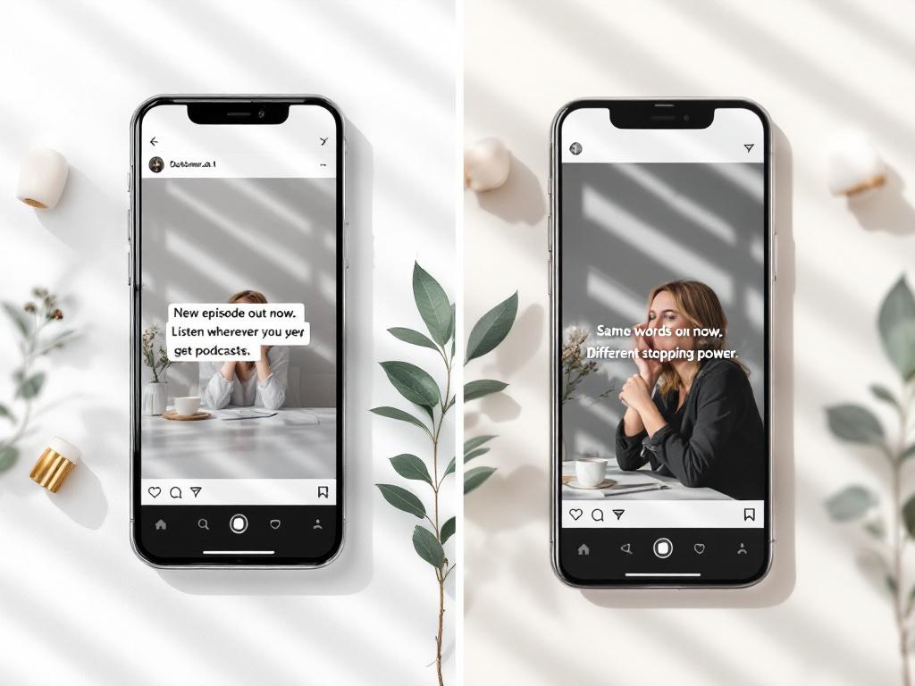
| Bold italic (serif) | 𝙃𝙚𝙡𝙡𝙤 𝙒𝙤𝙧𝙡𝙙 | Instagram, TikTok | CTAs, announcements, hooks | Strong on all devices |
| Slanted sans-serif | 𝘏𝘦𝘭𝘭𝘰 𝘞𝘰𝘳𝘭𝘥 (sans) | TikTok, X | Casual brand, tech, gaming | Excellent |
| Script / cursive | 𝓗𝓮𝓵𝓵𝓸 𝓦𝓸𝓻𝓵𝓭 | Instagram (lifestyle) | Bios, decorative phrases only | Poor at small sizes |
| Small caps | ʜᴇʟʟᴏ ᴡᴏʀʟᴅ | LinkedIn, X | Headlines, section labels | Good |
Three judgment calls separate the styled captions that work from the ones that don't.
Standard italic versus bold italic. Standard italic is for elegance and quotation; it implies the reader should slow down. Bold italic is the opposite — it shouts "look here first." Use standard italic for a one-line quote inside a 200-word LinkedIn essay. Use bold italic for the hook of an Instagram carousel where you need the first three words to win against eight other thumbnails in the feed.
Script is a trap. It looks beautiful in a hero shot of someone's bio screen, but glyph coverage for cursive Unicode is the worst of any block. On Android, on older browsers, on Windows machines without specific fonts installed, script characters often fall back to system serif — which means your "elegant" Unicode renders as plain serif italic to a meaningful slice of your audience. Use script only for short bio decoration where you've verified rendering on the devices your readers actually use.
Small caps signals authority differently than italics. Italics imply intimacy or urgency. Small caps imply formality, almost a "trademark" weight. Luxury brands and publishing-adjacent accounts lean on small caps for the same reason print magazines do — it reads as editorial, not promotional.
A working heuristic: pick one style per post. Mixing standard italic and script in the same caption looks amateur, because the eye reads inconsistency as accident rather than intention. If you've written a 120-word LinkedIn post and you want one phrase to land harder, italicize that phrase in one family and leave everything else plain. Restraint is what makes typography read as deliberate.
The Eight-Step Workflow to Generate, Test, and Publish Styled Captions
This is the workflow that takes you from a plain caption draft to a published, mobile-tested italicized post — without the rework most beginners burn an hour on.
1. Pick a generator with no sign-up and a real-time preview. Tools like LingoJam, YayText, and Toolzu all run client-side and don't require accounts. Avoid any tool that asks for a login to copy output — there's no technical reason this should be gated. If you're styling captions because you're producing multilingual content at scale, the same Unicode logic carries through localized versions you create with AI Dubbing.
2. Draft your full caption in plain text first. Write in Notes, Google Docs, or your platform's draft mode. Don't paste into the generator until you've locked the wording. Editing styled Unicode is painful — most text editors don't handle backspace, find-and-replace, or autocorrect cleanly when the characters are from the mathematical block.
3. Identify the 10–15% of text that deserves emphasis. Per readability research from Larson & Picard's "The Aesthetics of Reading" (CHI '05), excessive emphasis defeats its purpose — typographic emphasis only "hierarchizes reading" when used sparingly. Pick the hook sentence, one CTA, or one key metric. Not the whole caption.
4. Paste only that fragment into the generator. Don't paste the whole caption and try to extract one phrase afterward. The generator outputs every variant for whatever you input — keep your input scoped to the exact words you want styled.
5. Select the style that matches your platform. Standard italic for LinkedIn. Bold italic for Instagram hooks. Small caps for editorial headlines. Slanted sans-serif for TikTok and X. The comparison table above is your reference; you don't need to overthink this once you've picked a house style.
6. Copy the output and reassemble the caption. Paste the styled fragment back into your draft, replacing the original plain version. This is where most beginners fumble — they paste the styled version next to the plain version and end up with a doubled phrase, which the platform will happily publish.
7. Test on mobile before publishing. Open your platform's draft on the actual phone you expect your audience to use. iOS Safari, Android Chrome, and the Instagram app preview can all render the same Unicode differently. The Unicode Consortium notes that codepoints are standardized but glyph rendering depends on the device's installed fonts — platform compatibility is a guarantee for the character, not the appearance.
8. Keep hashtags and @mentions plain. Styled hashtags break clickability — the platform's hashtag parser only matches against standard ASCII characters. The same applies to @mentions. If you want a visually clean caption, move hashtags to the first comment, which is a common Instagram heuristic per PostNitro.
⚠️ Different generators map to slightly different Unicode blocks. If you switch tools mid-campaign, your styled output may render visually different even though it "looks the same" in the generator preview. Stick to one generator per content series.
Six Formatting Mistakes That Make Italicized Posts Look Worse Than Plain Text
Italicization is a tool. Like any tool, it's only useful when used with restraint. Six failure modes show up in feeds every day, and each one turns a styled post into something that reads as amateur rather than intentional.
- Italicizing more than 15% of your caption. Larson & Picard's reading research found that typographic emphasis "hierarchizes reading" only when used sparingly — overuse slows readers and reduces comprehension. The rule of thumb: one italicized phrase per sentence maximum, and never two consecutive italicized lines. If everything is emphasized, nothing is.
- Mixing two Unicode style families in one post. Standard italic next to script, or bold italic next to small caps, looks like a ransom note. The eye reads inconsistency as accident, not intention. Pick one style per post and stick with it for the duration of that content series — your brand recognition compounds across posts, not within a single caption.
- Forgetting that screen readers handle Unicode badly. WebAIM's 2021 Screen Reader User Survey found that non-standard text characters rank among the most damaging content patterns for accessibility. Screen readers may spell decorative Unicode character-by-character or skip it entirely. PostNitro flags this directly: third-party fonts "come with a major downside: accessibility" because screen readers "often can't interpret these special characters correctly." If you're producing content for audiences who need accessible formats — training videos, voiceovers, localized educational content — the better path is to deliver real audio with tools like Text to Speech, not decorative captions that assistive technology misreads.
- Italicizing instructions, warnings, or accessibility-critical text. Rello & Baeza-Yates' controlled experiments found that italic text "significantly decreases reading performance" for the 5–10% of the population with dyslexia. If your post tells someone how to do something or warns them about something, those sentences must be plain. Save italics for the parts where comprehension speed doesn't matter.
- Styling hashtags and @mentions. Generators will happily convert
#Marketingto#𝘔𝘢𝘳𝘬𝘦𝘵𝘪𝘯𝘨, which Instagram and X parsers will not recognize as a hashtag. The post loses discoverability for that tag entirely — and platform compatibility breaks at the parser layer, not the display layer. Keep tags and mentions in plain ASCII. - Treating italics as a substitute for line breaks. A 200-word caption with three italicized phrases is still a wall of text. White space, line breaks, and emoji bullets do more for scannability than any Unicode trick. Italics emphasize structure; they don't create it. If your post needs to breathe, give it actual air, not slanted letters.
Italics are emphasis. Emphasis loses power when overused. The posts that stop scrolls highlight one idea, not decorate every sentence.
Platform-by-Platform Italics Strategy
Where you place social media italics matters as much as whether you use them. Each platform has a different scroll pattern, a different reading distance, and a different audience tolerance for "extra." Treating Instagram and LinkedIn the same way is the fastest path to a styled caption that lands wrong on both.
Instagram captions. The first 125 characters appear before the "more" button on mobile. Italicize the hook — one sentence, bold italic preferred — to interrupt the scroll. Reserve standard italic for an in-caption quote or aside. Avoid italics in the call-to-action; the CTA needs to be unambiguously readable, and a slanted "Tap the link in bio" loses urgency. With users averaging two-plus hours a day across feeds, your hook has roughly two seconds — make that fragment work harder than anything else in the post.
LinkedIn posts. The audience is older, more accessibility-conscious, and reads more carefully. Use standard italic (not bold italic) to emphasize a single metric, a quoted phrase from a customer, or a contrarian aside. LinkedIn rewards long-form text; italics let you break up an 800-character thought without resorting to emoji bullets that read as unprofessional in B2B contexts. Avoid script entirely — it reads as frivolous in feed and signals "I don't know my audience."
TikTok captions. Video does the heavy lifting; caption italics are decorative more than functional. Bold italic on the first three words of the caption can reinforce the hook spoken in the video's first second — useful when sound-off viewing dominates. Don't italicize trending hashtag phrases — keep them plain so the algorithm picks them up. Short-form creators turning still images into scroll-stopping posts often pair styled captions with motion using an Image to Video workflow, which gives the caption something to support rather than carry alone.
X (Twitter). Character economy makes italics expensive: a styled phrase reads as more visual weight than plain text in a 280-character box. Use italic for one purpose only — quoting someone you're responding to, or marking a counterpoint. Bold italic feels too loud on X; standard italic is the safer choice. Small caps work well for short editorial-toned headlines, especially in quote-tweet commentary.
Email newsletters and Substack. This is the only context where italics can carry more of the caption load, because readers are subscribed, focused, and reading on bigger screens. Italicize pull-quotes, subheads, and the occasional sentence-level emphasis. Subject lines with one styled word can lift open rates noticeably — but test before committing to it as a series convention. Newsletter audiences are forgiving of styled text the way feed audiences aren't.
The psychology of slant. Italics carry inherited meaning from print: emphasis, urgency, foreign words, titles, asides. Bold italic borrows from advertising — "act now" energy. Small caps borrow from editorial — "this is the official term." When you pick a style, you're picking which print tradition you want your post to inherit. John Saito, formerly the content design lead at Dropbox and Airbnb, has argued that typography should "reduce cognitive load, not add to it" — the right italic style is the one your reader doesn't have to think about.
A/B test before you commit. Post the same message twice in a seven-day window with different italic placements. Measure saves, shares, and dwell time, not just likes. Two or three tests will tell you which style your specific audience responds to. There's no universal rule for an italicized text generator output — there's only your data. An audience of designers will reward small caps; an audience of fitness creators will reward bold italic; you find out by measuring, not by guessing.
For multilingual creators, the styling logic shifts between scripts. Mathematical Alphanumeric Symbols cover Latin and Greek but not Cyrillic, Arabic, Devanagari, or CJK. If you're publishing translated versions of the same post across languages, plain styling in non-Latin scripts is usually the only option, while your English captions can carry italic Unicode. Creators expanding to multiple languages often pair styled English captions with localized video content produced through Voice Cloning, which lets a single brand voice carry across target languages where Unicode styling doesn't apply.
Quick Answers to the Questions You'll Have at 11 PM Before Posting
Q1. Will italicized text generator output work on every social platform?
Yes, on every modern platform that supports Unicode — which is all of them: Instagram, LinkedIn, TikTok, X, Facebook, Threads, Pinterest, YouTube, and email clients. The only failure mode is older corporate networks or restricted devices missing fonts for the Mathematical Alphanumeric Symbols block. Platform compatibility is reliable on consumer devices. Always preview on the platform you're publishing to.
Q2. Is using an italicized text generator considered lazy or gimmicky?
No. It's a formatting tool, the same way bold and italic buttons are formatting tools in Word. Whether it looks gimmicky depends entirely on restraint. One italicized hook in a 100-word caption looks intentional. Five different Unicode styles in one post looks like a teenager discovered a font menu for the first time. The tool isn't the problem — overuse is.
Q3. Can I edit a styled caption after publishing?
Yes on Instagram, LinkedIn, Facebook, and X. The platform stores the Unicode characters and lets you edit any text in the caption field. If you need to change wording inside a styled phrase, the safest workflow is to re-generate the styled version in the generator and paste it back in, rather than trying to type new letters into existing Unicode — your keyboard will input plain ASCII and break the visual consistency.
Q4. Do italicized hashtags and @mentions still work?
No. Hashtag parsers and mention parsers only match standard ASCII characters. A styled hashtag like #𝘔𝘢𝘳𝘬𝘦𝘵𝘪𝘯𝘨 is not recognized as a hashtag — it's just text that happens to start with a pound sign. Always keep tags and mentions in plain ASCII, and if you want a clean caption, move hashtags to the first comment where they still index but don't clutter the body.
Q5. Will algorithms or SEO tools penalize me for Unicode characters?
No, algorithms read the underlying Unicode codepoints fine. But search-style discovery — like Instagram's keyword search or LinkedIn's content search — may not match styled words against plain-text queries. If a word matters for discoverability, keep at least one instance plain in the caption so the index can match it. Style the second mention, not the first.