
Your video is dubbed in 12 languages. The audio sounds native in each one. But your title card still reads "How to Grow Your Business" in English — and your French viewer sees it, your Japanese viewer sees it, your Brazilian viewer sees it. The audio localizes. The visuals don't. Your competitor's localized videos look finished; yours look 80% done.
A 3d text generator closes that gap. It lets you produce bold, on-brand title cards, lower thirds, and emphasis text in every target language — without learning Cinema 4D. In this guide on building stunning 3D text effects for localized videos, you'll learn which 3D text styles fit which content type, how to choose between manual and AI-driven tools, and how to handle the technical reality that German text runs up to 35% longer than English while Chinese runs 10–20% shorter, according to the Nielsen Norman Group.
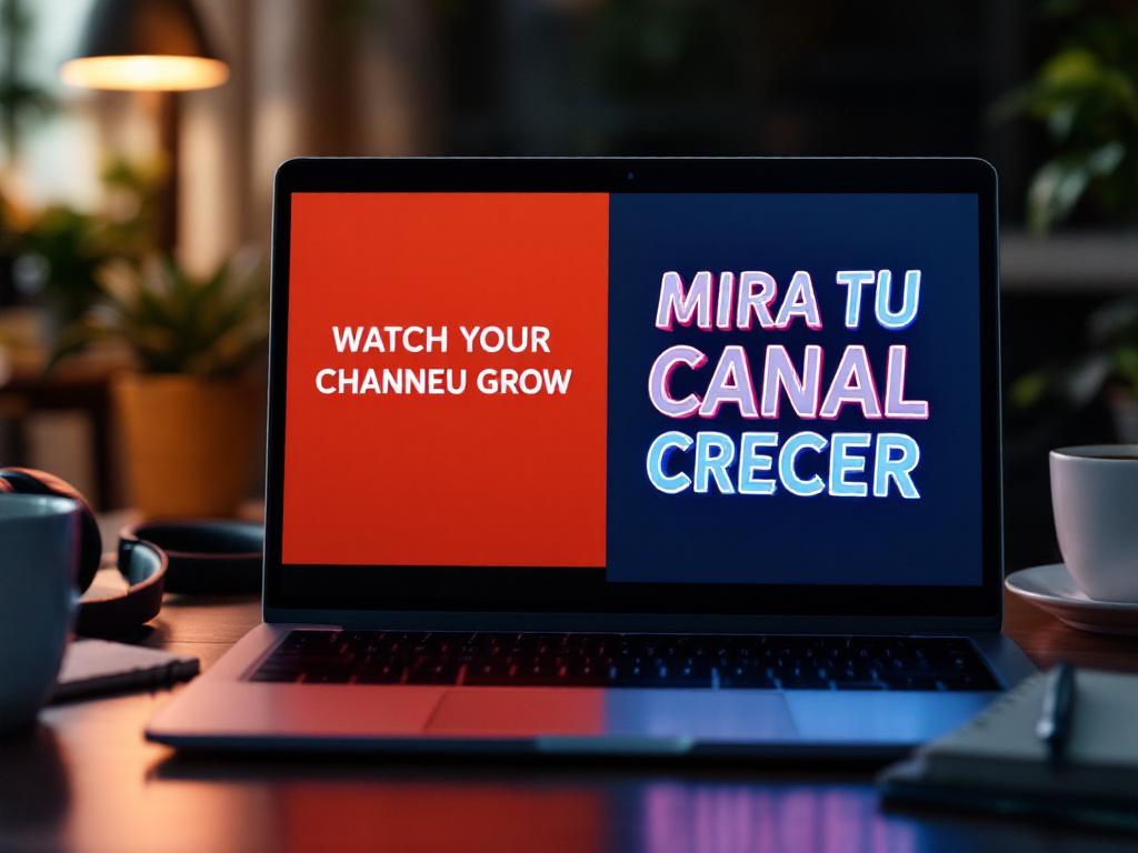
Table of Contents
- Why Localized On-Screen Text Decides Whether Your Dubbing Effort Pays Off
- Five 3D Text Styles and the Content Types They Actually Fit
- Manual Design Tools vs. AI 3D Text Generators — A Cost & Speed Comparison
- The Seven-Step Workflow for Adding 3D Text to Dubbed Video
- Multi-Language Text Production — Expansion, CJK Rendering, and Reading-Speed Limits
- Readability vs. Decoration — When 3D Text Hurts Your Video
- Your Production-Ready 3D Text Localization Checklist
Why Localized On-Screen Text Decides Whether Your Dubbing Effort Pays Off
You invested in AI dubbing. Your viewer hears native-sounding audio. So why does your retention curve flatten in the first 5 seconds for non-English markets? Because viewers process visual and auditory information together — and when your on-screen text contradicts your dubbed audio, the brain registers "this wasn't made for me" before the narration even starts.
Start with the silent-viewing reality. According to Digiday's reporting on Facebook video, 85% of Facebook video views happen with sound off. That means even a perfectly dubbed audio track is invisible to the largest share of social viewers. The on-screen text is what carries the message. If that text is in English while your audience speaks Portuguese, the dub doesn't matter for those viewers — they never hear it.
Then there's the completion math. A Verizon Media and Publicis study found videos with captions and on-screen text are 80% more likely to be watched to completion, with view-through rates 7.32% higher than uncaptioned versions. Localized 3D titles do something captions can't: they signal "this video is for you" within the first two seconds, before the viewer makes the keep-watching decision.
The purchase-intent layer hits harder. CSA Research — a vendor source serving the localization industry — reports that 76% of consumers prefer to buy products with information in their own language, and 40% will never buy from sites in another language. On-screen text in a product demo, tutorial, or course intro IS product information. When it stays in English, you're actively triggering that 40% non-purchase response in every non-English market you ship to.
Dubbed audio gets you in the door. Localized on-screen text decides whether viewers stay.
For e-learning and corporate training, the stakes shift from revenue to learning outcomes. Winke, Gass, and Sydorenko (2010), publishing in Language Learning & Technology, found ESL learners scored 75% on comprehension with captioned video versus 51% without — a 47% relative gain. If you're producing training content for a workforce that speaks five languages, localized on-screen text isn't a polish item. It's the difference between knowledge transfer and noise.
Where does 3D text specifically help? Plain captions handle dialogue. 3D titles handle hierarchy. A bold 3D section header tells the viewer "this is a chapter break" in any language — no parsing required. A 3D lower third introduces a speaker with visual weight that flat text can't deliver against busy footage. A 3D number callout ("3.2x ROI" or "47% lift") makes a stat land in the half-second a viewer gives it. These are information architecture roles, not decoration roles.
Creators who've already wired up AI Dubbing for audio understand the operational logic: build the system once, ship in many languages. The mistake is stopping at audio. 3D text isn't decoration — it's the visual layer of that same architecture. It only works when it stays readable in every language you ship in, which is where most creators stumble. The next section covers the styles that survive multilingual production and the ones that don't.
Five 3D Text Styles and the Content Types They Actually Fit
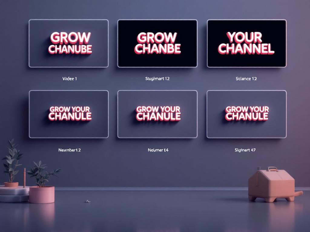
Style choice is content-type driven, not taste-driven. The wrong style adds noise; the right one adds hierarchy. Before you fire up any 3d text generator, decide which of these five categories your content lives in — then commit. Mixing styles across the same series tells viewers your brand is unsettled.
1. Extruded Block Text. Solid geometric depth, flat front face, visible side walls. Best for corporate explainers, course intros, channel branding. The front face stays clean, which means maximum legibility at small sizes. The extrusion reads as "official" without screaming. Risk: looks dated if over-rendered with heavy specular highlights. Tool examples: Adobe After Effects with the Cinema 4D renderer, Spline, Blender. Keep extrusion depth between 6 and 12 pixels at 1080p for a contemporary feel.
2. Beveled & Shadowed Text. Rounded edges, soft drop shadow, subtle gradient on the front face. Best for YouTube intros, vlog titles, and stat reveals ("$1.2M Raised" or "10K Subscribers"). The bevel catches simulated light, making the text feel premium without crossing into cinematic territory. Risk: bevels under 2 pixels disappear on mobile, and per YouTube for Press, over 70% of YouTube watch time comes from mobile devices. If your bevel doesn't survive a 6-inch screen, it doesn't exist.
3. Neon Glow / Pseudo-3D. Outline strokes plus inner and outer glow, often with a chromatic shift. Best for tech reviews, gaming content, music videos, and product launches. High contrast against dark backgrounds; reads as "modern" instantly. Risk: terrible on light backgrounds and unreadable against complex footage without a backing plate. If your video lives on bright outdoor B-roll, skip this style entirely.
4. Perspective-Skewed Text. Text rotated on the Y or X axis, vanishing point creating depth. Best for documentary openers, sports content, and motion-heavy reveals. The skew implies motion and scale, which works for energetic content. Risk: this is the hardest style to localize. Skewed German text often clips off-frame because of the 20–35% text expansion documented by the Nielsen Norman Group. If you ship in Germanic or Slavic languages, build a fallback layout before you commit.
5. Layered Depth Text. Multiple copies of the same text stacked along the Z-axis with slight color shifts between layers. Best for educational content with step numbers, listicles, and before/after comparisons. The layering communicates sequence visually — a viewer registers "this is the third item" without reading the number. Risk: too many layers (more than four) becomes mud. Keep depth count low and color separation high.
Manual Design Tools vs. AI 3D Text Generators — A Cost & Speed Comparison
Three production paths exist for getting 3D text onto your timeline. The right one depends on how many languages you ship in and how often you rework the same text. Choosing wrong burns hours per video — and across 33 target languages, that's a workflow that quietly bankrupts your production schedule.
| Factor | Manual (After Effects, Blender) | AI 3d Text Generator | Hybrid Approach |
|---|---|---|---|
| Setup per text element | 30–60 min | 3–8 min | 10–15 min |
| Learning curve | Weeks | ~30 min onboarding | Moderate |
| Customization ceiling | Unlimited | Preset-bounded | High |
| Cost model | $20–55/mo software | Credit or freemium | Combined |
| Speed across 10+ languages | Slow — manual per language | Fast — template-driven | Fast with brand control |
| Best fit | Hero brand films | Social, courses, multilingual | Recurring series |
| Expansion handling | Manual reframing | Template-aware | Template + override |
The break-even math. Manual design wins when you're producing one hero asset per quarter. The moment you cross into three or more languages per piece or four or more pieces per month, the per-element cost in After Effects exceeds the credit cost of an AI generator. The After Effects Cinema 4D renderer is genuinely powerful — full control over extrusion depth, bevel, and material — but render times balloon when you re-render the same scene for each language variant. Five languages mean five renders mean five queue waits.
Where AI generators fall short. Preset libraries trap you in the same five looks every other creator uses. That's fine for course modules where consistency matters more than differentiation. It's brand-damaging for premium content where your title card is part of how viewers recognize you. The hybrid path — AI generator for the base render, manual color and spacing pass for polish — solves this for creators with a recognizable visual identity. You get template-driven speed plus the 10% of customization that makes your titles look like yours.
The localization multiplier. This is the column most comparison articles ignore. If you ship in five languages, every text element gets produced five times. Manual workflows multiply linearly: 5x time, 5x cost, 5x render queue. Template-driven AI workflows scale flat or near-flat — you replace the text content, the template handles the rest. For creators using AI Dubbing across 33 target languages, only the template approach is operationally viable. The manual approach mathematically doesn't fit in a 40-hour week.
The Seven-Step Workflow for Adding 3D Text to Dubbed Video
This is the production sequence that survives when you actually ship multilingual content week after week. Each step has technical specifics — read them once, then turn this into your own template.
Step 1: Export Your Dubbed Master First
Set your output resolution and frame rate before exporting from your AI Dubbing workflow — most 3D text tools work in 1080p/30fps or 4K/30fps, and switching mid-project causes timing drift. Note your audio peak levels; you'll match them when the final composite renders. Lock the export codec to H.264 for broad tool compatibility, or ProRes if your design tool supports it. Save the source-language version too — you'll use it as the timing reference when building text overlays for other languages.
Step 2: Map Your Text Placement Against the Safe-Title Zone
The industry standard is to keep essential on-screen text within the central 80% of the frame — a 10% margin on each side, per BBC Technical Delivery Standards. For 1080p, that's 1728 pixels horizontally and 972 pixels vertically. Mark these zones in your editor as guides before placing any 3D text. Account for caption strips at the bottom — your 3D titles should sit in the upper two-thirds, leaving room for the subtitle band that often gets added in localization passes.
Step 3: Choose Your 3d Text Generator Based on Output Need
Three tiers exist. Web-based AI tools like Spline or Vectary give the fastest turnaround with preset depth and material controls — best for high volume. Editor plugins like CapCut Pro or DaVinci Fusion offer inline 3D titles synced to your timeline — best for medium volume where you want one tool. Adobe After Effects' Cinema 4D renderer gives full control for hero pieces. Per Greyscalegorilla, a vendor source for motion design training, keep render quality at Draft while iterating, then push to final quality only on the export pass — this alone can cut iteration time in half.
Step 4: Set Your Style Parameters Once, Save as a Template
Lock in font (one display face, one body face — no more), extrusion depth (4–12 pixels works for most 1080p content), bevel size (at least 2 pixels to survive mobile downscaling), light angle, and a color palette tied to your brand. Save this as a preset or reusable composition. This template is the asset you'll reuse across all 33 dub languages — without it, you'll redesign the same wheel for every export. The template is the system; everything else is content.
Step 5: Generate Each Language Variant Against the Template
Replace text content per language. Check character count against expansion data: French and Italian run +15–20%, German +20–35%, Spanish +15–25%, Russian +20–30%, while Chinese and Japanese run −10 to −20%, per Nielsen Norman Group. If your English title is 18 characters, your German variant could hit 24. Resize the text, don't crop the layout. For CJK languages, verify your chosen font has full character coverage — many display fonts ship Latin-only and will silently substitute when you paste Japanese.
Step 6: Sync Text Timing to the Dubbed Audio, Not the Original
Dubbed audio in a longer language (German, Russian) runs longer than the source. If your English title appears at 00:03 and stays for 2 seconds, the German equivalent may need to appear at 00:03 and stay for roughly 2.8 seconds because the surrounding narration extends. The Netflix Timed Text Style Guide caps subtitle reading speed at 17 characters per second — the same logic applies to on-screen titles. Give viewers time to read. This timing logic matters even more if you're generating narration through Text to Speech, where the synthesized pace can differ from your reference audio.
Step 7: Verify Contrast, Then Render
Run a contrast check before export. WCAG 2.1 mandates 4.5:1 for normal text and 3:1 for large text. 3D effects often pull color values toward mid-gray on bevels and side walls, which can drop your effective contrast below threshold even when the front face passes. Add a semi-opaque backing plate if your 3D title sits over moving footage. Render at final quality, then review on a 6-inch phone screen before publishing. If it fails on the phone, it fails for roughly 70% of your audience.

Multi-Language Text Production — Expansion, CJK Rendering, and Reading-Speed Limits
The most common reason multilingual 3D text breaks isn't the design — it's the assumption that one layout fits all languages. English is unusually compact. When you build a 3D title card sized for "Watch Your Channel Grow" (24 characters), the German equivalent "Sehen Sie Ihren Kanal wachsen" runs 30 characters — and that's before you encounter longer phrases. Microsoft's globalization guidelines recommend allowing 30–50% extra horizontal space in any text container that will be localized. For 3D text, where extrusion adds visual weight on top of character count, that space pressure compounds.
Here's the practical expansion table to keep at your workstation:
| Target Language | Expansion vs. English | Layout Action |
|---|---|---|
| French / Italian | +15–20% | Allow 1 extra line |
| German | +20–35% | Reduce font 10–15% or abbreviate |
| Spanish | +15–25% | Standard layout + margin |
| Russian | +20–30% | Pre-build wider container |
| Chinese / Japanese | −10 to −20% | Allow more whitespace |
| Arabic / Hebrew | Variable + RTL flip | Mirror entire layout |
CJK font selection is non-negotiable. Most display fonts marketed as "3D-ready" ship Latin and Cyrillic glyphs only. When you swap your English title for Japanese, you'll either get tofu boxes (□□□) where characters should be, or the system will silently substitute a fallback font that breaks your 3D extrusion entirely. Build your template with a font that has verified CJK coverage — Noto Sans, Source Han Sans, or Adobe Fonts' multi-script families. Test before you commit a workflow to it. Paste a paragraph of Japanese, Korean, and Simplified Chinese into a test composition and confirm every glyph renders with the extrusion applied.
Reading-speed adjustments per language. Netflix's 17 characters-per-second cap is built for Latin scripts. CJK characters carry more semantic density per glyph — a Japanese viewer reads at fewer characters per second but absorbs equivalent meaning per character. Your 3D title's on-screen duration should adjust by language, not stay fixed. A rough rule of thumb: hold titles about 1.2x longer for CJK content than the English source. Test with a native speaker if you can; the pacing difference is real.
Pre-build three template variants, not 33. Instead of one rigid template stretched across every language — or 33 individual templates that nobody can maintain — build three sizing variants. Compact (CJK languages, allows extra whitespace), Standard (English, Spanish, French, Italian), and Expanded (German, Russian, Finnish, Polish). Map each of your dub target languages to one of the three variants. This collapses an unmanageable 33-template problem into a maintainable 3-template system.
Build three template variants, not thirty-three. One source, three sizes, every language covered.
The discipline here mirrors what creators already do for audio with Voice Cloning and AI dubbing — one source, many language outputs, built on a system rather than ad-hoc work. 3D text deserves the same operational thinking. Creators who skip it ship 33 dubbed videos with English title cards and wonder why their non-English watch time underperforms. Creators who build the three-template system ship 33 fully localized videos in roughly the same production time it used to take to ship one.
Readability vs. Decoration — When 3D Text Hurts Your Video
3D text is a tool, not a default. Used poorly, it actively reduces comprehension. The research on this is unambiguous, and the failure modes are predictable. Here are the six ways 3D text breaks your video — and how to fix each one.
Contrast collapse on bevels and sides. WCAG 2.1 requires 4.5:1 contrast for normal text. 3D extrusions create mid-tone side walls that often hit 2:1 or worse against busy footage. Your front face passes the check; your bevel doesn't. Fix: add a semi-opaque rectangle behind the title, or restrict 3D text to frames with solid-color backgrounds. If you must place 3D text over B-roll, choose footage with a quiet zone where the title sits.
Decoration overriding legibility. Nielsen Norman Group's research on legibility, readability, and comprehension states fancy display effects should be used sparingly and never for body text. UX specialist Kate Moran is direct in NN/g's typography guidance: "Fancy text styles…can impede readability if they reduce contrast or distort letterforms. Legibility is more important than decoration." Fix: 3D for titles and stat callouts only. Never for subtitles. Never for body content.
Cognitive overload from animation. Mayer and Moreno's multimedia learning research shows decorative motion increases extraneous cognitive load and reduces comprehension. A spinning, bouncing, glowing 3D title forces viewers to process the animation before the message. Fix: limit motion to entrance (≤0.5 seconds) and exit (≤0.3 seconds). No idle animation. Your title should arrive, hold still while the viewer reads, and leave.
Redundant text duplicating narration. Moreno and Mayer (2002), in the Journal of Educational Psychology, found that on-screen text exactly duplicating spoken narration can reduce comprehension via split attention. Fix: use 3D text for emphasis points, chapter markers, and stats — not running narration restated word-for-word. The narration and the on-screen text should complement each other, not race each other.
Mobile-killing detail. With over 70% of YouTube watch time on mobile per YouTube for Press, 3D effects that require an 80-inch screen to read are invisible to most viewers. Fix: preview every 3D title at 6-inch phone scale before publishing. If a bevel disappears, increase it. If a glow loses definition, increase the contrast of the underlying text. If you can't read it on a phone, it doesn't exist for most of your audience.
Forgetting text-content localization. Translating "Buy Now" to French handles the words. But "$99" needs to become "99 €" with reordered formatting; "January 5" becomes "5 janvier"; "5,000" becomes "5.000" in many European locales. A 3d text generator won't catch these — your localization process must. Fix: include date, currency, and unit formats in your translation brief, not just the prose. Treat numerals as content that requires localization, not as formatting that travels unchanged.
Your Production-Ready 3D Text Localization Checklist
Print this. Tape it next to your monitor. Run every multilingual video through it before you publish — once you've shipped three videos using the list, the steps become automatic.
- Dubbed master exported with confirmed resolution, frame rate, and codec matching your design tool's input requirements.
- Safe-title zones marked at 10% margin from each frame edge per BBC delivery standards.
- 3d text generator selected based on volume — web AI for high-volume, plugin for medium-volume, After Effects Cinema 4D renderer for hero pieces.
- Master template built once with locked extrusion depth (4–12 pixels), bevel size (≥2 pixels), light angle, and brand color palette.
- Three sizing variants saved — Compact (CJK), Standard (Western European), Expanded (Germanic/Slavic).
- Font verified for multi-script coverage — Noto Sans, Source Han Sans, or equivalent confirmed for all CJK targets.
- Text content translated AND localized — dates, currencies, units, and number formats adjusted, not just words swapped.
- Per-language character counts checked against expansion data (German +20–35%, CJK −10 to −20%).
- Timing synced to dubbed audio, not source audio — hold duration adjusted per language length.
- Contrast verified at 4.5:1 for normal text per WCAG 2.1 — backing plate added if 3D walls drop below threshold.
- Mobile preview completed on an actual 6-inch phone screen, not a desktop preview window.
- Motion limited to entrance and exit only — ≤0.5 seconds per transition, no idle animation.
Pair this checklist with your audio workflow and you have a complete localization production system. Developers building this into a pipeline can integrate the AI Dubbing API or Text to Speech API to automate the audio side, then connect outputs to sibling tools like Image to Video or an AI image generator for the visual layers — one source asset, every language, every format, shipped from one workflow.